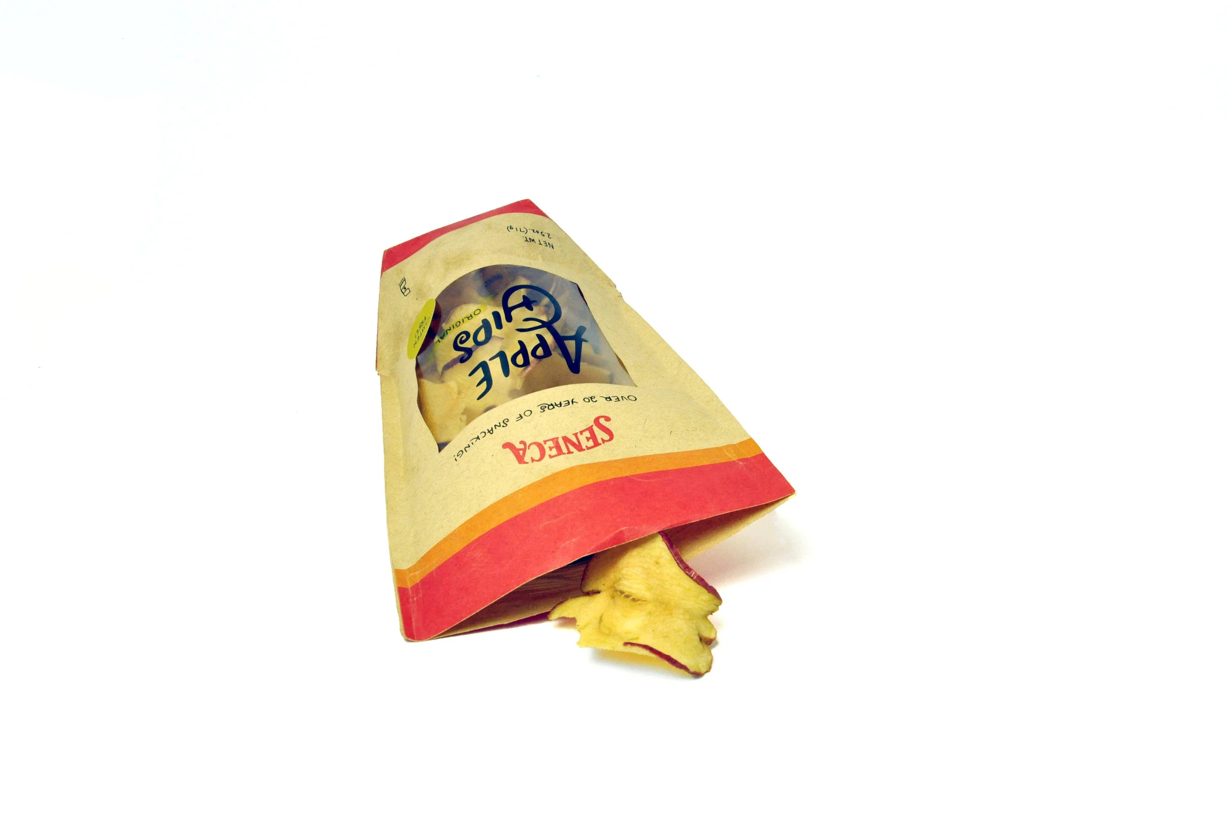
seneca APPLE CHIPS
branding, packaging
Redefining the rusticity of a quality apple chip product through a logo refresh and package redesign.
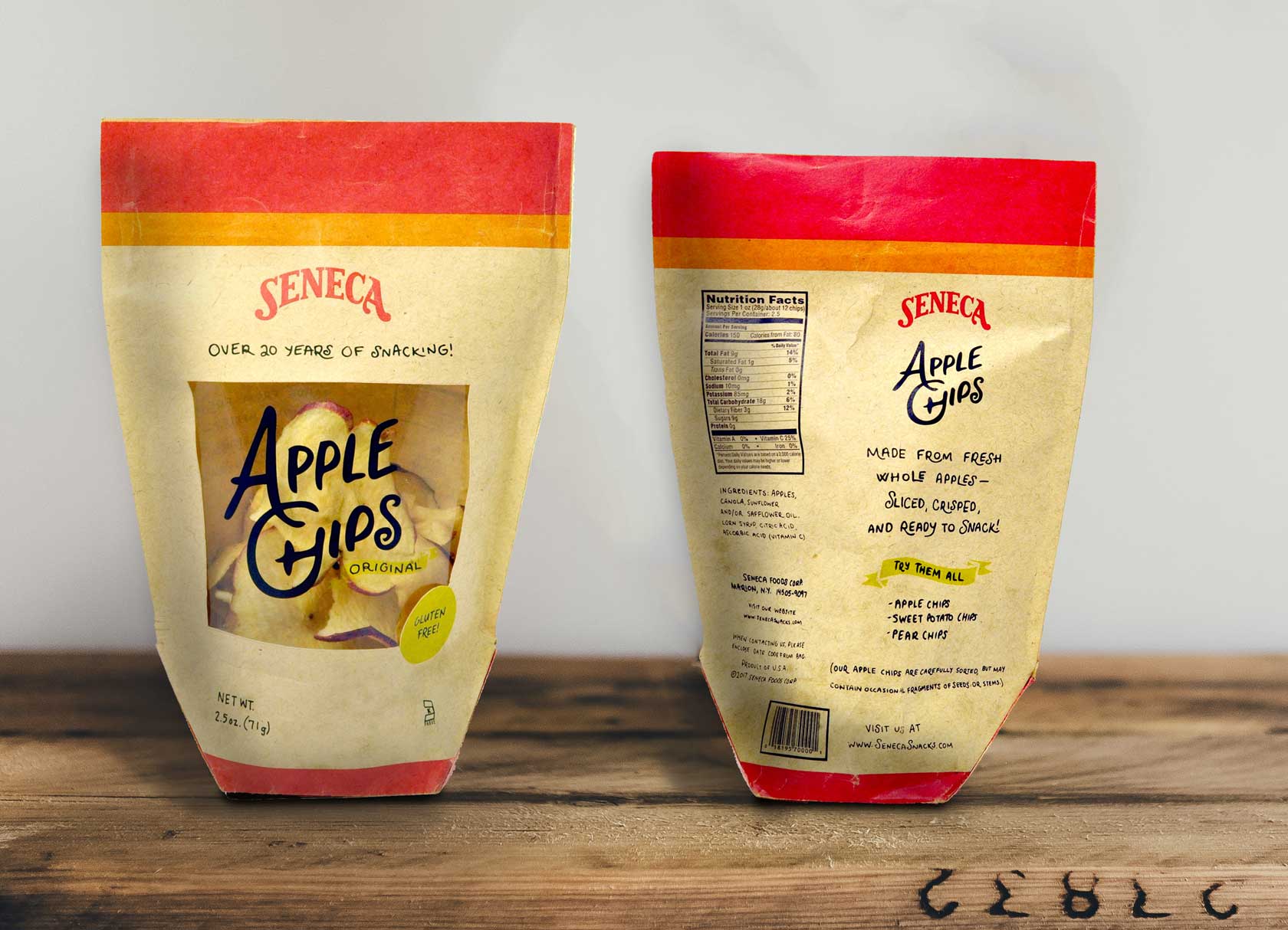
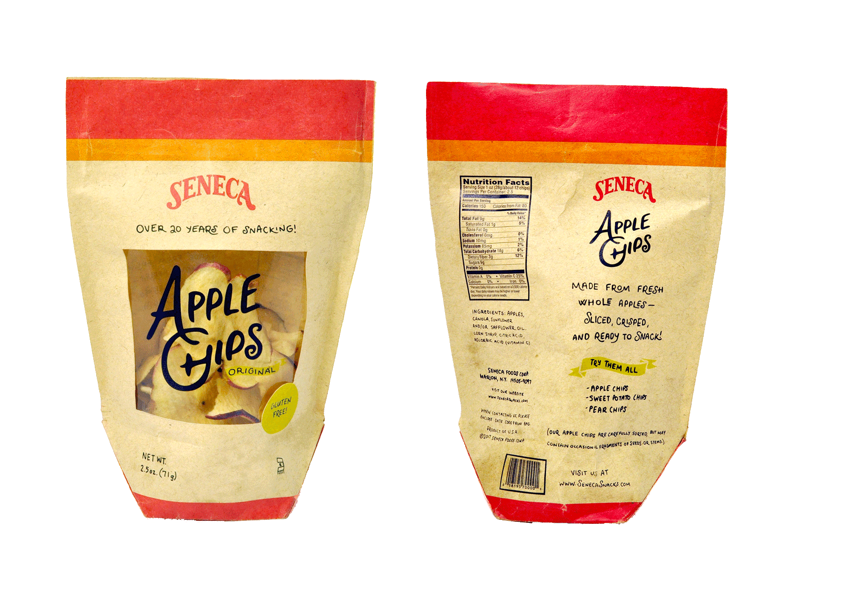
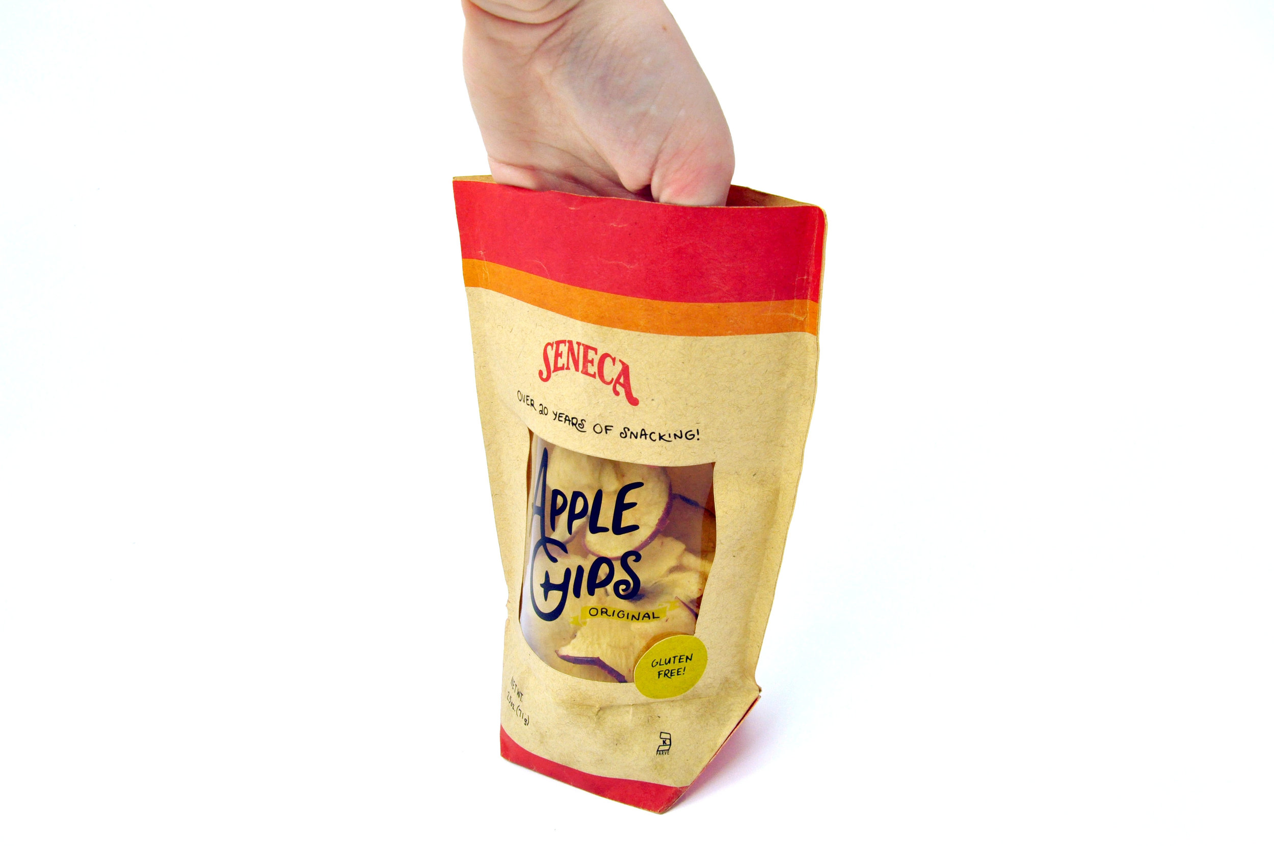
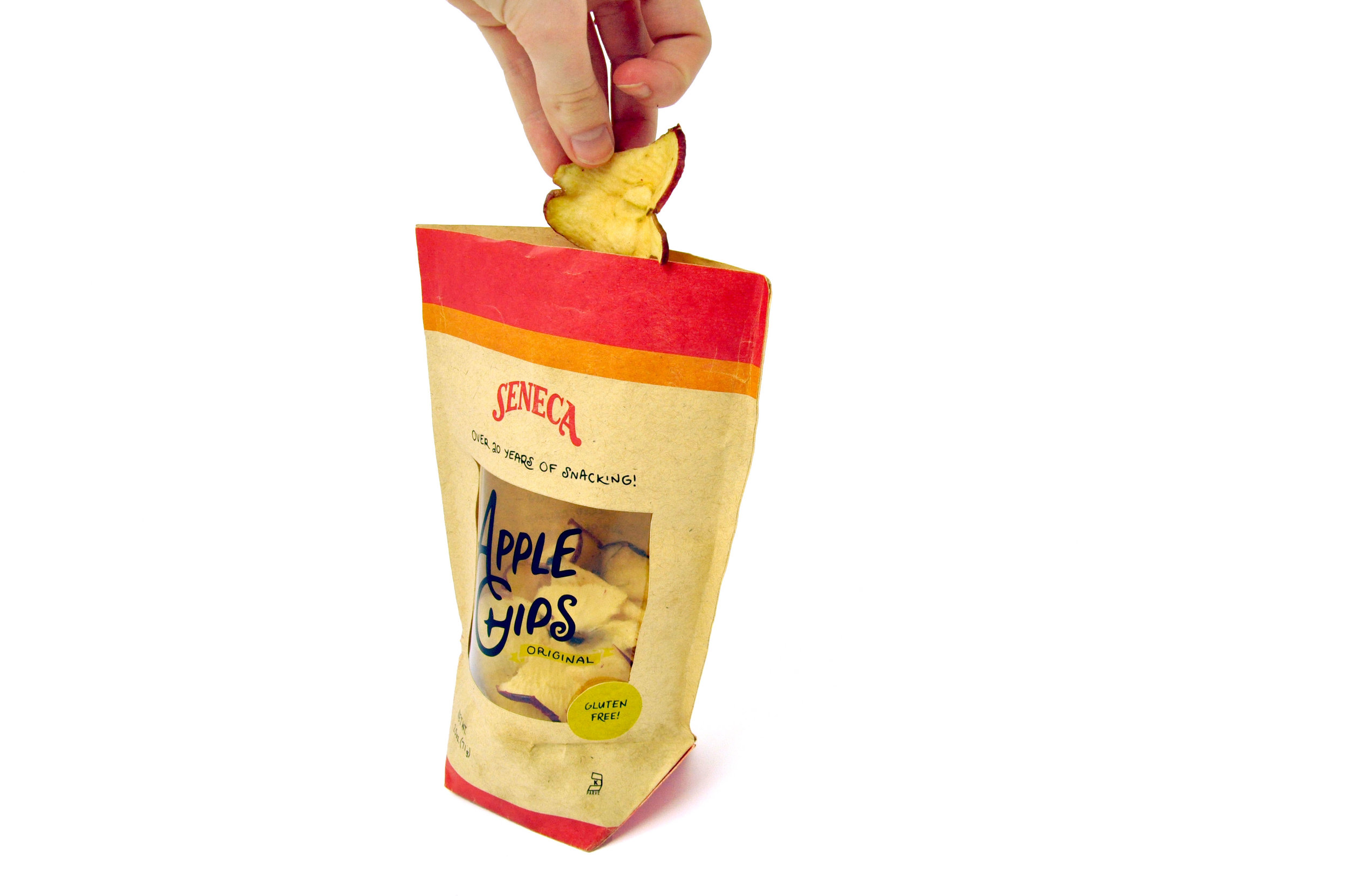
This was a rebranding and packaging project for Seneca brand Apple Chips. I created the package to be a stand-up, resealable bag, instead of the standard chip bag. There are multiple servings per bag, so a zip seal will keep the contents fresh. The contents are clearly visible through a window on the front panel.
Original packaging
Logo Refresh
The decoration around the original logo was eliminated and the Seneca logo was simplified into a word mark. The signature Seneca red is used in the refreshed logo.
custom lettering
Seneca is a top leader of the apple chip industry, and some of their values include sustainability and a farm-to-table mindset. The custom hand lettering maintains the rusticity of the brand without relying on textures or additional graphics that had cluttered the original packaging.


