Ten Gun Design
UX Capstone, workshop, case study
A case study on the process of designing an interface for household resource consumption.
For the capstone class of the User Experience Design Minor, Ten Gun Design worked with our class during Spring quarter of 2018 at Western Washington University. They came to us with a fictional company to design around, called Mason Homes.
The Team
Our team of four represented three disciplines of the User Experience minor.
Hannah Chute, Graphic Design
Melissa Gonzalez, Computer Science
Max Prendergast, Graphic Design
Scotty Patton, Industrial Design
The areas I contributed were in market research, storyboarding, user flows, digital prototyping, and interface design.
The Client
Mason Homes designs and builds prefabricated smart-homes. These homes are designed to reach net zero energy and focus on implementing connected technologies into everyday life.
The brief
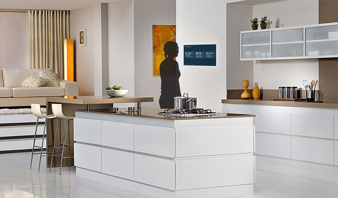
Ten Gun Design gave us the challenge to positively change a homeowners utility consumption through elegant display of real-time data. Ten Gun suggested exploring avenues that would motivate users to create actual change in their daily habits regarding utility consumption. We were also encouraged to explore cutting-edge technology, namely OLED technology. The project also provided an opportunity to design an interface that functions within a fully-connected home in a seamless and practical manner.
target demographic
Our target demographic consists of tech-savvy home buyers. They are aspirational individuals, but have a lack of patience for poorly designed technology that wastes their time.
Market Research
We looked at several different technologies that are currently available in the smart-home market. Most of the applications out there do not work under one program. Users would have to be running multiple apps to gain data on different consumption points.
Some products connect to one system, like the Wink Hub device, or Amazon Alexa. However, these products do not display information that our users indicated they would like to see. Through our product research, we learned that it is important to have a visual component to these smart-home technology apps, such as a display or other visual interface.
Audience Research
We started our research by putting out a survey, and received responses from 60 people. The participants were concerned with the environment but cared more about the impact on their wallet when it came down to why they would want to use less resources.
When asked about a pre-installed display, most participants wanted the integrated display in the kitchen, where most appliances in the house exist. From this display, they would like to see in depth data (like graphs/charts), as well as easy to interpret information/graphics.
We learned two main things from research: Money motivates, and the real-time data is a primary value to the users.
Solutions Proposal
It is important to show homeowners the impact their utility usage has on the environment and on their wallet. Our research participants were interested in tools that track their resource consumption and conveniently display real time results. This should monitor all energy and resource consumption in the house, displaying this information in a way to motivate them to take steps toward reducing their resource usage instead of scaring them into it.
Benefit Statement
A platform that displays all of the household resource consumption data in one interface. This platform would allow the user to monitor and control these resources. The interface can help the homeowners save money and resources by providing recommendations/presets.
Storyboards
We created storyboards to better understand which features made sense to offer, as well as how users would interact with them. We highlighted a few key situations derived from our exploration report including goal setting, problem solving, and various house modes.
User Flows
To get started on the structure of this concept, we came up with some user flows.
Initial User Flow
Detailed User Flow
Revised User Flow
prototyping & User Testing
Alpha Testing
Beta Testing
Digital Prototype Testing
Solution
We arrived at our solution after the testing and prototyping phase. Feedback from testing subjects informed our design and organizational decisions. Our solution is unique with Mode settings that automatically trigger responses in the home that will save the homeowner money.
Presentation
To conclude the workshop, we presented our project at Ten Gun’s studio in Edmonds, Washington. They were supportive of the mode concept, appreciating the fact that users would be able to set these modes very easily, and even have the ability to set modes in advance through the calendar. This aspect of the project was important to our design, so we were glad that they could see value in that system.
Presenting at Ten Gun also provided an opportunity to receive some constructive feedback. They suggested building out the blueprint of the house to indicate the abilities to tap into each room and control specific appliances. They also brought up that some rooms will naturally consume more energy than others, and asked how we would make sure users are aware of what rooms they need to pay attention to. We can see a potential solution to this problem by creating an algorithm that takes that issue into consideration and “weights” each room differently. More trafficked rooms would be weighted with the fact that they get everyday use.
Overall this workshop experience was extremely valuable to have the opportunity to work with a design firm and other fields in UX.


