Bill Speidel's Underground tour
branding, copywriting
The creation of an identity that authentically reflects the history and quality of a unique city tour.
Bill Speidel's Underground Tour is a well-established guided tour located in the heart of historic Seattle, attracting both locals and tourists alike. Beneath the sidewalks of Pioneer Square, underground passageways remain from before the Great Fire of 1889.
This rebrand concept aims to refresh the current branding with an identity that accurately reflects this well-established business.
logo redesign
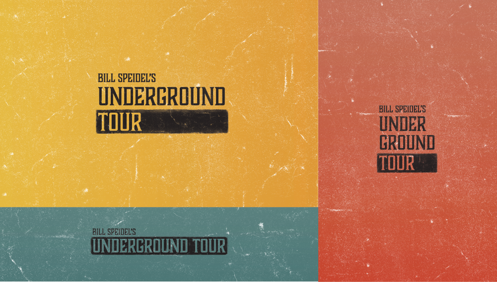
A major portion of this project was redesigning the Underground Tour logo. History is a value of the Underground Tour, so it was important to make sure this was evident from the logo. I referenced type specimens from the 1890s to make sure the logo accurately represented the time period of the Great Seattle Fire.
Logo Redesign
Original logo
The logo is flexible and can be rearranged to fit the desired space. All logos have the lowest line of type in a solid bar, a signature element carried across the brand.
Branding
Color
The colors of the brand were drawn from advertisements from the 1880s. The bright colors bring a liveliness to the brand to fit with the lighthearted nature of the tour.
typography
The primary typeface is Boucherie Block, and supporting body copy is set in Mrs Eves XL Serif.
imagery
The images used in the branding are all historic images of Seattle around the time of the Great Seattle Fire, and are treated with the bright colors of the brand.
graphic elements
Ornaments from specimens of the 1880s are used as borders and other graphic elements.
poster campaign
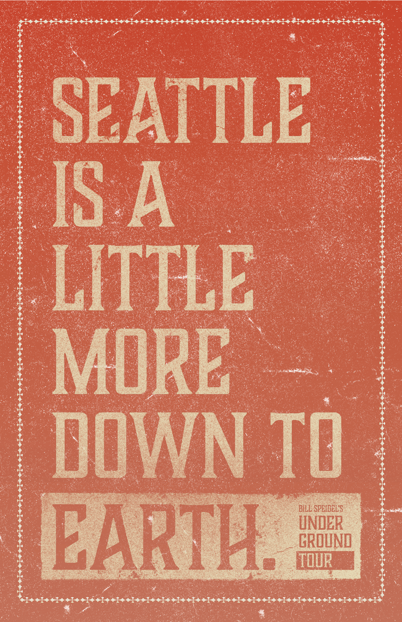
The posters were designed to market the Underground Tour, and can be used individually or in a set. A part of this project was doing the copywriting for the headlines on the posters, which reference Seattle, its history, and the subterranean nature of the tour.
website
This design simplifies the website into the three main relevant pages, Home, Tickets and About.
applications
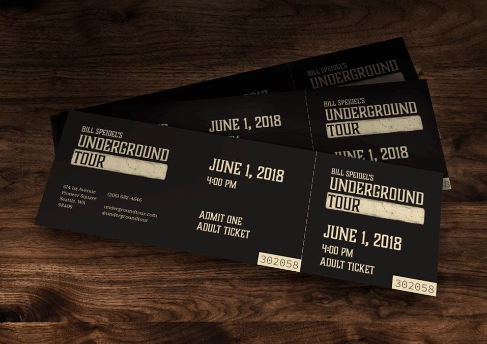
The pub next door to the ticketing office is an additional opportunity for brand extension.


