New balance
branding, environment, 3d rendering
A fresh approach in the identity and retail experience of an athletic footwear company.
New Balance is an athletic footwear company dedicated to making quality products that improve and support the active lifestyles of their customers.
The purpose of this conceptual project was to rebrand New Balance in order to appeal to a younger audience. This rebrand includes a logo redesign as well as designing a new experience for New Balance customers to introduce them to the new brand.
The original environments were rendered using Rhinoceros and Keyshot.
The original logo
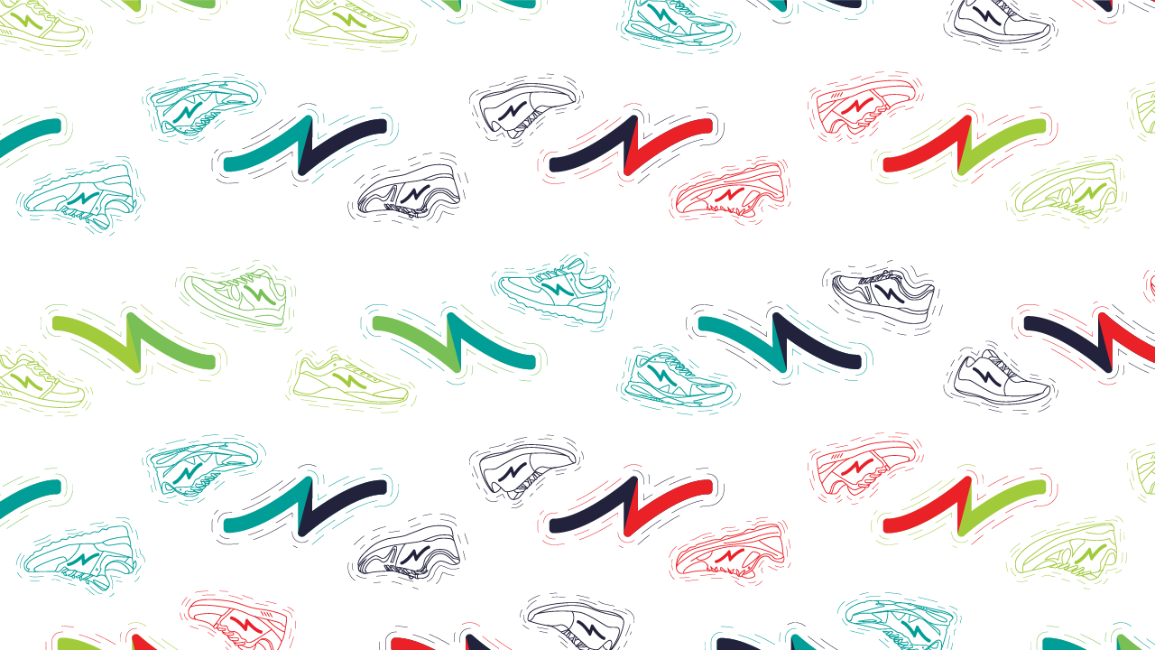
The new ideas were an attempt to rebrand the company to appeal to a younger audience. After comparing to competitors, I combined the best elements of each of these three logos into one final logo design.
Innovation generates a more creative, empowering brand. I developed the final rebrand with a focus on innovation, allowing the design to be somewhat playful and freeform without losing its reference to the technology in the roots of the company.
Benefits of this logo include the ease and consistency of application. Rather than having an “N” on the New Balance shoes separate from the standard company “NB” logo, this new logo could be easily applied on the shoes, increasing the recognition between product and company.
Environment concept: Pop-Up Store
A major piece of this project was developing an environment in which to display these new designs and introduce the rebrand in application. Pop-up stores provide a great opportunity for the audience to truly experience a brand, in a way that cannot be achieved elsewhere. Developing a physical exhibition of the rebrand is more likely to have a greater impact on the audience than a strictly digital or product rebranding.
The design for the walls include glass surfaces, shelving, storage area, mirror and featured products area.
The pop up store fits within the dimensions of 15x20x20 feet. Two stories with glass paneling on front with the brand designs within the glass.
An additional storefront display is created from a physical version of the new logo that has dual functions: providing a bench area for customers as well as a store entry display zone.
Environment Concept: Midtown Retail
The second environment concept shows the brand in a more traditional retail environment.
Promotional materials for the brand would include poster series and track bags.


